
How Latin American developers are breathing new life into existing centers by reinventing the brand experience.
We don’t often think of a retail center as a “brand.” But experts will tell you that a “brand” is exemplified—and either reinforced or belied by—the user experience. And what is more of an experience than a consumer’s visit to a retail destination?
True: retail tenant mix may ultimately be the key to a successful shopping center, but how that mix is “packaged” is a key ingredient. Architecture, signage and graphics are the elements creating that “packaging”—better defined as the center’s brand.
Shopping center developers and owners all over the world are taking a closer look at their properties’ brands, understanding that their center is nothing without an identifiable and memorable experience, and that experience can be influenced by (at least) or wholly redefine (at best) the environment’s brand experience.
Indeed, Latin America provides numerous examples of how the right mix of architectural and graphic elements effectively “brands” a mall. Whether contemporary or traditional, imported or indigenous, shopping centers in the region increasingly take their cues from what the public wants—and the results resonate throughout the world.
Some are using branding elements to breathe renewed life into an existing center—totally reinventing the user experience without so much as moving a building or knocking down a wall. Others are starting new projects with a center’s brand at the very core of the ultimate development vision. In either case, the results are remarkable, noticeable and proving to achieve actual business objectives.
What’s in a Brand?
In terms of style, developers working in Latin America strive to provide safe, secure, family-oriented retail, dining and entertainment destinations, and are highly sensitive to the subject of branding. Inspiration is gained from design trends in the U.S., but carried out in more economic means with a focus on court and main features. Common mall areas tend to be value-engineered. But even so, there are cases where even modest investments in brand development have paid figurative and literal dividends almost immediately.
The branding starts with design. Two centers may seem alike in layout and tenant mix, but may have two specifically unique “feels” to them. That “feel” is part of the brand, and it starts with design. Center X may be contemporary, emphasizing glass, metals and other polished services; while Center Y may blend terra cotta, natural woods, more landscape features and the like. What the site looks like as the user moves through it (materials, finishes, etc.) most certainly shapes the user experience, and hence, the brand.
The brand is informed by site planning. The family aspect is a key component of branding shopping centers. For the family-focused center, the brand is influenced by design and planning considerations: a playroom next to a food court, carousels, train rides through the center, green park space for child play, children’s events and activities, etc.
Retailers share the brand. Center X might have more name retail brands, for example, while Center Y may focus to a greater extent on local merchants. We instinctively know what it feels like to shop in an “upscale” center versus a more “pedestrian” center. That feeling we get, good or bad, is another representation of the brand.
The brand is captured by sights and sounds. Once the center is open, how the site is animated, both in visual appeal and event programming, will go a long way toward shaping and either reinforcing or betraying the anticipated or intended brand experience. Eye-popping graphics and signage have made Disney instantly recognizable and memorable, and shopping centers are no different. Signage and graphics may be bold and boisterous or subtle, sophisticated and staid. Whichever a property owner chooses is a branding decision—conscious or not.
The audience interprets the brand. Considering the ideal audience of the opened center informs brand considerations, as well as planning, design, graphics, signage and programming considerations. Brand-conscious developers carefully profile their malls before they even start planning, identifying all aspects including amenities, architecture and signage that will not only capture, but convey, the center’s appropriate brand experience.
Success Stories
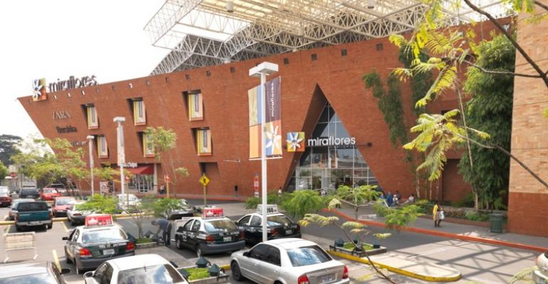
For example, Miraflores, originally 9,500 square meters in Guatemala City, was a successful mall with room to grow. The expansion was to coincide with renovation of the existing center, therefore requiring consistency between existing and new. With the expansion, the existing mall and a new three-story fashion court and new retail offerings were carefully blended by introducing accent detailing to the variety of finishes recalling traditional and colorful local fabrics. Supporting landscaping, lighting and a street design would ultimately marry well with the surrounding urban fabric.
But it all emanated from a brand.

The existing project slogan, "see the life", was a driving inspiration behind the mall renovation. Various design directions were explored in the first stages of the signage and graphics development. Concepts ranged from a logo-driven approach to a very whimsical design that matches the personality of this retail destination, and further to a third, clean and minimal option. The chosen direction leads to a more genuine and natural approach with simple lines and earth tones to compliment the physical environment.
The exterior façade concept for the new space continued existing brick finishes while celebrating the building’s terminus by introducing accent detailing in a variety of colored brick patterns to recall traditional and colorful Guatemalan fabrics. Supporting landscaping, building and site lighting, along with street re-design allowed the project to integrate sensitively into the surrounding urban fabric.
The result is a rebranded center with a new logo, signage and distinct market impact, keeping cohesion between existing and new mall phases. The expansion and renovation adds a new and exciting dimension to what is now one of the largest and most successful malls in the region!
Oakland Mall in Guatemala City was another solidly performing center, featuring 159 stores on four levels—many of which are the only stores for a given retailer in Guatemala. From a brand experience standpoint, Oakland Mall is differentiated by modern design and natural illumination, green areas, architectural curves, natural sounds, interactive fountain, rustic structures with aluminum-coated glass, fine finishes and roundabouts of applied technology.

This needed to be captured by the representative branding elements, from the center’s logo to signage. The soft curves of the emphasized “O” found in the project’s identity serve as inspiration for the signage. Utilizing the materials and finishes of the mall, cool tones of the curved metal panels are balanced by warm wood tones in this simple yet sophisticated sign system. Ultimately, the visitor’s experience at the center is mirrored, complemented and amplified by the brand identity sprinkled throughout the center for users to see, experience and enjoy.
Also in Guatemala City, Portales is a new 40,836-square-meter mall, where the branding and logo developed were driven by the regional environment and the primary audience segment: families.
Breaking with the traditional "mall and court" shopping center design, modern retail, restaurant, and entertainment offerings are designed along a sweeping curved space, drawing visitors through the mall. An iconic identity tower and sleek contemporary design is balanced with a variety of warm interior finishes and tones while incorporating natural light and ventilation and numerous smart- and green-building initiatives.
For Portales, the goal was that the design should not intimidate shoppers—especially families. The combination of local décor that was developed indeed insures that shoppers are comfortable with the environment—and the brand.

The branding and logo developed for this mall was driven by the vibrant colors found in the native textiles and art of the region. The vibrant and bright color banding gives energy to the shopping center by using it in various ways and places throughout the project. The interior wayfinding items balance these exciting colors by using materials used in the architecture that are calming and neutral such as warm woods and brushed metal.
As a result, a brand was born: as familial, comfortable and inviting as the center itself. Today, the center is the preferred destination for families in and around the surrounding market area.
Tegucigalpa, Honduras, is home to Mall Las Cascadas, an existing center branded, in a sense, by its 130 international stores like Benetton, a hotel, financial center, skating rink, cinema—the most complete mall in the city. It also needed a facelift, and with that came brand-new signage and mall graphics and a new mall logo—a new look for a successful and growing center.
The brand needed to be reborn. The retail mix was right, the layout was fine, but the center needed “life.” After a successful rebrand, the user experience has been completely reinvented…and reinvigorated. Indeed, without costly investments in renovation or capex improvements, it is almost as if the shopping center is an entirely different destination altogether. In this case, new brand = brand new.
Branding Lessons Learned
As opposed to other parts of the world, in Latin America there is a tendency not to wait for a center to really show its age, but to proactively keep malls on the cutting edge. In other words, developers and owners in Latin America don’t wait for an economic downturn to address a mall’s issues. Their counterparts in the States may now be facing economic realities that necessitate rebranding efforts to reinvent the center experience, but being proactive like developers in Latin America prove that it’s never too soon for a great re-visioning.
Part of the role of designers and branding strategists is to educate clients on the importance of signage and graphics and the way they can make a project unique—with the opportunity to leverage the power of graphics and visual design to round out the skillful renovation of a mall or mixed-use center for a fraction of the cost of a ground-up renovation. Savvy developers and owners in Latin America are clearly demonstrating that understanding, and taking the lead.
The bottom line is branding. And branding can positively influence the bottom line. Intellectually, items such as painted panels, wall murals and frescoes may be seen as decoration, but in commercial developments, they function as much more than just “eye candy.” From sophisticated wall-coverings, to banners, signage, flat screens and multimedia walls, the graphic and aesthetic elements of a space can play a vital role in the overall brand experience. They can unify or break up a space visually and conceptually, animate, inspire, comfort and engage.
Ultimately, such elements have the power to help malls distinguish themselves by creating a unique and defining identity…a certain unquantifiable essence of a destination that is reinforced and amplified throughout every possible user exposure to the center, from sites and sounds to experiences tantilizing every sense. It is an almost unidentifiable experiential attraction that draws visitors in, and draws shoppers back.
In other words, a brand.
Valerie Cataffa is Vice President, Director of Operations, and Director of Graphics with Baltimore, U.S.A-based DDG, an innovative architecture, planning, design and graphics firm with a history of creating high-profile, high-quality environments around the world. For more information, visit www.ddg-usa.com.