
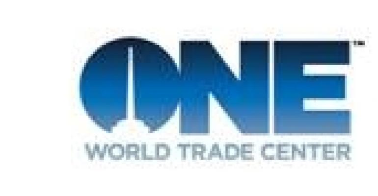
NEW YORK CITY—The Durst Organization and Cushman & Wakefield have introduced a logo for One World Trade Center in Lower Manhattan.

The logo will appear in a Pantone 301 flat blue—which the team calls "One World Trade Center Blue"—for use in such basic applications as postcards and stationery. In more dynamic adaptations, the logo will be presented in a combination of colors intended to mimic the Lower Manhattan sky. The brand’s font is a slightly customized version of Hoefler & Frere-Jones’s Gotham.
One World Trade Center will feature three million sq. ft. of class-A office space on 71 office floors. The building will rise to 1,776 ft. upon completion, scheduled for the end of next year.

The brand was designed by Wordsearch, a branding and communications firm serving the international real estate and architecture sectors. The logo and tagline are part of a multi-faceted international leasing campaign. Additional components will include the rollout of printed and interactive collateral, a website, marketing events and other elements.
The property is being jointly developed by the Port Authority of New York and New Jersey and The Durst Organization.